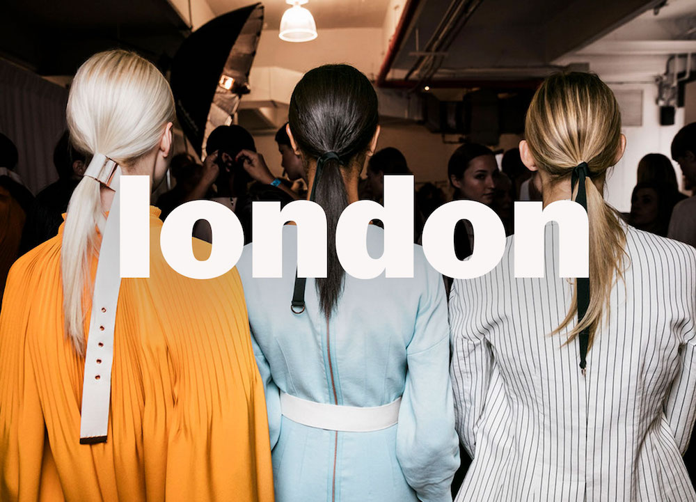
London Fashion Week Spring/Summer 2021, as the second stop of fashion Week on the Fashion Month circuit, over 80 brands gathered in the UK ,involving a mixture of digital and physical presentations. It didn’t disappoint us even though it was in the midst of a lock-down. JW Anderson was right when she said that” Sometimes a fashion show is more than a fashion show” because this fashion show had all kinds of eye-catching styles and colors.
The main point in this fashion week was joy, and that was obvious from the colors. Starting from the shades of sunny yellow, pretty light pinks and purples, and different shades of blue till the basic colors which are the shades of silver and oily green, and definitely these are the colors that we all need to see after a very tough, bad, and dark time that we went through because of corona pandemic and its consequences.
Pantone Fashion Color, recognized as the color standards system for London fashion week for this season. Here are the top colors that were in London fashion week 2021:
- PANTONE 14-3205 – Pirouette

This shade of light pink, brings us comfort. - PANTONE 16-0436 – Pickled Pepper
Mixing grass green color with light yellow which feels so tangy. - PANTONE 15-3716 – Purple Rose
The light purple is quietly elegant. It feels fresh and represent love at first sight. - PANTONE 16-1253 – Orange Ochre
This orange shade goes with all seasons and breaks up the cool of early spring. - PANTONE 13-5412 – Beach Glass
A watery aqua color, this color symbolizes renewal and healing, also its a metaphor for life.
- PANTONE 14-1050 – Marigold
It’s a golden orange shade that lends a warming presence, and it symbolizes positive emotions and energy. - PANTONE 18-4250 – Indigo Bunting
It’s a shade of blue between light and dark blue. It symbolizes bright and gorgeous spirit. - Pantone 18-1552 – Lava Falls
It’s a shade of red that’s full of energy and power. - PANTONE 13-0647 – Illuminating
A bright color that brings joy, and it presents the color of a sunny day. - PANTONE 16-4535 – Blue Atoll
Blue Atoll is the color of the ocean and the sky; it often symbolizes serenity, stability, inspiration, wisdom or health.Not only these joyful colors, but also there were 5 core classic colors :1- PANTONE 11-0202 – Baby’s Breath
This tinted off-white color appears soft mood.2- PANTONE 17-1221 – MacchiatoMacchiato is like a cup of coffee with a shade of cream.
3- PANTONE 19-4105 – Polar Night
Polar night is a dark blue with black tones, its also called twilight blue.4- PANTONE 17-5104 – Ultimate Gary
The color ultimate gray is a timeless and practical color, and its also attractive at the same time.5- PANTONE 18-0529 – Sphagnum
Sphagnum is the moss plant color, when you’re looking at this color you may feel the smell of nature, which arouses our passion to explore life.
There was a high level of creativity that was done by the designers, it was obvious from the different styles of the items that were designed and by the shades of colors that were used in the show that will suit different tastes of people and also will suit different skin tones.
By: Yara Sinokrot


